
When we first bought our home we knew from the get-go that there were a lot of changes that we wanted to make to bring our home out of the early 2000s and into a more classic and timeless style. But, we wanted to be strategic in how these changes and updates should be done. And the biggest question that we kept asking ourselves was and still is “what materials fit with the story that we’re telling with our home?”. Before we started yanking things off of the walls and breaking up cabinets, we wanted to spend just a little time in our new home to fine tune the design ideas that we’ve been dreaming of since we toured it. However, we quickly got antsy with… the paint.
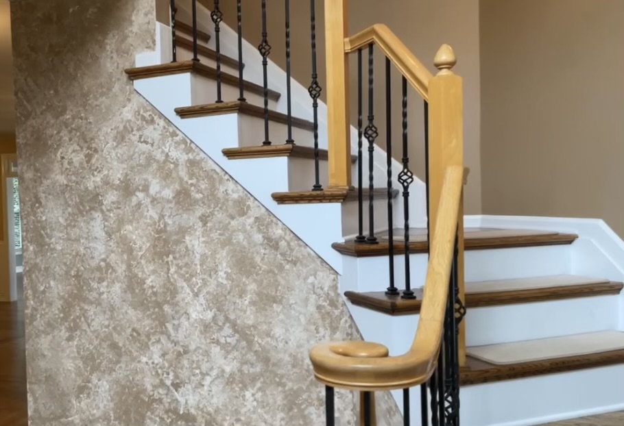
Our home had shades of mocha brown, yukon gold, one blue room, off white moulding, and a sponge texture wall (click here if you want a look at that before and after) greeting you when you enter the doorway–yikes. We kept focusing on how much we hated the paint and how we still felt like we were visiting the home and not the ones who owned it. We decided that the best way for us to start our home renovation journey was to start with a blank slate for the walls so we can better visualize how we can renovate and style each space. And since we didn’t have any of the power tools yet for our bigger projects, painting was an easy project for us to knock out and feel satisfied that we’ve started our design updates.
Soon, we will do a lot of white paneling, wainscoting, moulding, and built-ins. So we wanted to select a few colors for now that will be a classic addition and something we’d actually like to have peeping around the surrounding white wall adornments down the road. We flipped through countless magazines, home blogs, and, of course-the paint sample wall at Sherwin Williams to help us get inspired but still focused on the main goal: not having to paint the rooms twice because we regretted the color!
The most important thing that we can suggest is to pick colors that not only work together but work with how you want to style your home. For us, we wanted to take our 90s built suburban home to a timeless style that you’d see in any Nancy Meyers film, flipping through Zillow in the Hamptons, or something you’d see in pictures of historic colonial homes. In our case then, we wanted one color to be the main star of the show and selected a second color for our bedroom and bathroom (for now!). We’ll add in a few other colors down the road, especially when we tackle the bathrooms! So to start, we wanted a warm creamy beige and a classic dusty coastal blue that will fit perfectly with our home’s story. The main thing for us is we didn’t want our home to feel like a patchwork quilt where the rooms didn’t feel flow well together and each room felt like a different house. We wanted them to work together and evolve from room to room to tell a story.
For our beige, we chose Sherwin Williams Champagne 6644. It brings such warmth to a room with its subtle peachy undertone and really sings with our existing white and wooden accents. And for our blue, Sherwin Williams Sea Salt 6204 (they categorize it as green, it definitely rides the blue/green line for us). We love this color. We wanted our primary bedroom and bathroom to have a pop of color to give us a bit of a sanctuary. We love that it is a contrast to the Champagne that is in most of the home but they look so nice together. So when you see our room from the hallway, it doesn’t feel like our home is a patchwork quilt.

Sherwin Williams Champagne (SW 6644)

Sherwin Williams Sea Salt (SW 6204)
Both paints were purchased in the Emerald paint base in Satin. If you have a dark wall to cover, make sure to grab a gallon or two of primer. Remember that sponged detail wall? Primer was a life saver! And the best part, both Champagne and Sea Salt SING with white paint beside it.
Of course the whole painting process took longer than anticipated (a little over 3 weeks) and we had areas with 18 foot ceilings that we had to get creative with. But the end result still makes us smile every time we walk into the room. We tackled the entryway foyer, kitchen, formal dining room, formal living room, office/sunroom, living room, breakfast nook, primary bedroom, primary bathroom, AND the second floor hallway. So that 3 week timeline doesn’t look so bad afterall in retrospect! I will say too, we did not paint EVERY day. Nor all day when we did. We both work and had to squeeze it in when we had time and we also got sick near the end of our painting project. Painting takes time and lots of patience so take breaks, drink water, and don’t sweat the mess. It’ll be worth it in the end!
We will have another blog soon on our tips and ticks on how to paint your home interior yourselves and for some of our favorite products that we used and bought multiples of. If you would like to subscribe to our email list so you get the first notice on when that blog and others are live, please sign up in the sidebar!
We also plan on keeping an always up-to-date list of our paint colors too – just for easy reference.
Thanks for reading and being along for the ride with us!